Overview
- Question
- Loading and Initial Observation
- Explore
- Draw Conclusions
Questions
A brief overview of the data is given from The Kaggle Project Page. Some points from this overview:
- On April 15, 1912, during her maiden voyage, the Titanic sank after colliding with an iceberg, killing 1502 out of 2224 passengers and crew
- One of the reasons that the shipwreck led to such loss of life was that there were not enough lifeboats for the passengers and crew
- Although there was some element of luck involved in surviving the sinking, some groups of people were more likely to survive than others, such as women, children, and the upper-class.
The main goal will be to answer the question: Who is the most likely to survive?
Loading and Initial Observation
# Data Analysis
import pandas as pd
import numpy as np
from scipy import stats, integrate

%matplotlib inline
# Visual
import seaborn as sns
import matplotlib.pyplot as plt
sns.set(color_codes=True)
# Load data
titanic_df = pd.read_csv('titanic-data.csv')
Beginning Analysis: View a couple rows of the data to get an idea of the variables in this sample
# View Data
titanic_df.head()
| PassengerId | Survived | Pclass | Name | Sex | Age | SibSp | Parch | Ticket | Fare | Cabin | Embarked | |
|---|---|---|---|---|---|---|---|---|---|---|---|---|
| 0 | 1 | 0 | 3 | Braund, Mr. Owen Harris | male | 22.0 | 1 | 0 | A/5 21171 | 7.2500 | NaN | S |
| 1 | 2 | 1 | 1 | Cumings, Mrs. John Bradley (Florence Briggs Th... | female | 38.0 | 1 | 0 | PC 17599 | 71.2833 | C85 | C |
| 2 | 3 | 1 | 3 | Heikkinen, Miss. Laina | female | 26.0 | 0 | 0 | STON/O2. 3101282 | 7.9250 | NaN | S |
| 3 | 4 | 1 | 1 | Futrelle, Mrs. Jacques Heath (Lily May Peel) | female | 35.0 | 1 | 0 | 113803 | 53.1000 | C123 | S |
| 4 | 5 | 0 | 3 | Allen, Mr. William Henry | male | 35.0 | 0 | 0 | 373450 | 8.0500 | NaN | S |
Data Categorizing
Referring to Kaggle and our data above, we can make some brief overviews of each column. Looking from left to right:
-
PassengerId: Index given to each person
-
Survived: Ordinal integer showing whether the passenger survived (1) or died (0)
-
Pclass: Ordinal integer showing ticket class ranging from first (1) to third (3)
-
Name: String denoting the name of the passenger. The names are in Last, Title First format
-
Sex: Categorical string indicating either a male or female passenger
-
Age: Integer showing the age of the passenger
-
SibSp: Integer showing number of siblings or spouses they are traveling with
-
Parch: Integer showing number of parents or children they are traveling with
-
Ticket: String showing the passengers ticket number
-
Fare: Float integer showing how much they paid for the ticket
-
Cabin: String giving the cabin number for each passenger
-
Embarked: Categorical string showing the port that they departed from
In addition to the data types, the first couple rows also show that there are missing entries in the Cabin column. Looking further into the total data set gives an idea of which areas are incomplete
titanic_df.info()
<class 'pandas.core.frame.DataFrame'>
RangeIndex: 891 entries, 0 to 890
Data columns (total 12 columns):
PassengerId    891 non-null int64
Survived       891 non-null int64
Pclass         891 non-null int64
Name           891 non-null object
Sex            891 non-null object
Age            714 non-null float64
SibSp          891 non-null int64
Parch          891 non-null int64
Ticket         891 non-null object
Fare           891 non-null float64
Cabin          204 non-null object
Embarked       889 non-null object
dtypes: float64(2), int64(5), object(5)
memory usage: 83.6+ KB
Missing Data: There are a total of 891 entries, however the following columns only contain:
- Age has 714
- Cabin has 204
- Embarked has 889
Dealing with Missing Data
There are a good deal of missing values in the data. Embarked appears to be the simplest to deal with. Observing the entries with missing values leads to some conclusions. It looks like these two passengers roomed in the same cabin with the same ticket and fare. It is safe to assume that they left from the same port.
titanic_df[titanic_df.Embarked.isnull()]
| PassengerId | Survived | Pclass | Name | Sex | Age | SibSp | Parch | Ticket | Fare | Cabin | Embarked | |
|---|---|---|---|---|---|---|---|---|---|---|---|---|
| 61 | 62 | 1 | 1 | Icard, Miss. Amelie | female | 38.0 | 0 | 0 | 113572 | 80.0 | B28 | NaN |
| 829 | 830 | 1 | 1 | Stone, Mrs. George Nelson (Martha Evelyn) | female | 62.0 | 0 | 0 | 113572 | 80.0 | B28 | NaN |
# Plot to get an idea of spread of data
plt.figure(figsize=(5, 8))
plot = plt.subplot(111)
sns.boxplot(titanic_df['Embarked'], titanic_df['Fare'],hue=titanic_df['Pclass'])
plot.set_title('Boxplot of Fare in each Port')
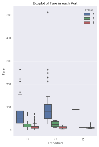
Observing the boxplot above concludes that these missing values should be replaced with C. Looking at Fare values for each port, you can see that the median for first class passengers at C is right around 80.
#Replace null values with C
titanic_df = titanic_df.set_value(titanic_df.Embarked.isnull(),'Embarked','C')
Age has a large amount of missing values. Age is also a key factor that will be used, so there should be entries for the missing data. Using numpy to generate random values for these missing entries will be effective enough. As long as the data is within a standard deviation, our data set will still be accurate enough to visually observe
for data in titanic_df:
    avg_age = titanic_df['Age'].mean() # Average age
    std_age = titanic_df['Age'].std() #Age Standard Deviation
    null_age = titanic_df['Age'].isnull().sum() #Number of null values

    null_age_random_list = np.random.randint(avg_age-std_age, avg_age+std_age, size=null_age) #Numpy random integers
    titanic_df['Age'][np.isnan(titanic_df['Age'])] = null_age_random_list
    titanic_df['Age'] = titanic_df['Age'].astype(int)
Clean the Data
Re-labeling some data points makes for easier to read data. The new points are put into a separate column. The old columns will also still be used for the survived column to make use of easily adding the integers if they are needed
#Create Survival Label Column
titanic_df['Survival'] = titanic_df.Survived.map({0 : 'Died', 1 : 'Survived'})


# Create Pclass Label Column
titanic_df['Class'] = titanic_df.Pclass.map({1 : 'First Class', 2 : 'Second Class', 3 : 'Third Class'})


# Create Embarked Labels Column
titanic_df['Ports'] = titanic_df.Embarked.map({'C' : 'Cherbourg', 'Q' : 'Queenstown', 'S' : 'Southampton'})
Explore
#Describe information for all numberic entries
titanic_df.describe()
| PassengerId | Survived | Pclass | Age | SibSp | Parch | Fare | |
|---|---|---|---|---|---|---|---|
| count | 891.000000 | 891.000000 | 891.000000 | 891.000000 | 891.000000 | 891.000000 | 891.000000 |
| mean | 446.000000 | 0.383838 | 2.308642 | 29.489338 | 0.523008 | 0.381594 | 32.204208 |
| std | 257.353842 | 0.486592 | 0.836071 | 13.493263 | 1.102743 | 0.806057 | 49.693429 |
| min | 1.000000 | 0.000000 | 1.000000 | 0.000000 | 0.000000 | 0.000000 | 0.000000 |
| 25% | 223.500000 | 0.000000 | 2.000000 | 21.000000 | 0.000000 | 0.000000 | 7.910400 |
| 50% | 446.000000 | 0.000000 | 3.000000 | 28.000000 | 0.000000 | 0.000000 | 14.454200 |
| 75% | 668.500000 | 1.000000 | 3.000000 | 37.000000 | 1.000000 | 0.000000 | 31.000000 |
| max | 891.000000 | 1.000000 | 3.000000 | 80.000000 | 8.000000 | 6.000000 | 512.329200 |
Getting a more detailed description of the numerical columns gives an idea of the range of values for each column. Overall, about 38% of the passengers survived the crash. Also, even though the average ticket price is 32, there appears to be a large spread of values since the max is 512.
titanic_df.describe(include=['O'])
| Name | Sex | Ticket | Cabin | Embarked | Survival | Class | Ports | |
|---|---|---|---|---|---|---|---|---|
| count | 891 | 891 | 891 | 204 | 891 | 891 | 891 | 891 |
| unique | 891 | 2 | 681 | 147 | 3 | 2 | 3 | 3 |
| top | Graham, Mr. George Edward | male | CA. 2343 | C23 C25 C27 | S | Died | Third Class | Southampton |
| freq | 1 | 577 | 7 | 4 | 644 | 549 | 491 | 644 |
The object string descriptions give some notable insights to the data:
- There appear to be a majority of males that took the cruise.
- There are 681 unique tickets, which means several people received the same ticket or the information was not recorded accurately
- Cabins can have multiple different values under one name. This could be due to a family purchasing tickets under a single family members name
Observing Rates of Survival
Viewing the correlation of passengers that survived and died to each separate variable is the best way to see which factors should be focused on. Using histograms for numerical columns and bar graphs for categories is the simplest way to visualize the data initially and get an idea of which variables to focus on.
#Barplots to view variables vs Survival
plt.figure(figsize=[15,15])

#subplot tool to easily format the plots
#Sex
plot1 = plt.subplot(321)
sns.barplot(titanic_df.Sex, titanic_df.Survived)
plot1.set_ylabel('Survival Rate')
plot1.set_title('Survival Rate of Each Sex')

plot2 = plt.subplot(322)
sns.countplot(x='Sex', data=titanic_df)
plot2.set_ylabel('Total Passengers')
plot2.set_title('Total Passengers of Each Sex')

#Ports
plot3 = plt.subplot(323)
sns.barplot(titanic_df.Ports, titanic_df.Survived)
plot3.set_ylabel('Survival Rate')
plot3.set_title('Survival Rate of Each Port')

plot4 = plt.subplot(324)
sns.countplot(x='Ports', data=titanic_df)
plot4.set_ylabel('Total Passengers')
plot4.set_title('Total Passengers of Each Port')

#Class
plot5 = plt.subplot(325)
sns.barplot(titanic_df.Class, titanic_df.Survived)
plot5.set_ylabel('Survival Rate')
plot5.set_title('Survival Rate of Each Class')

plot6 = plt.subplot(326)
sns.countplot(x='Class', data=titanic_df)
plot6.set_ylabel('Total Passengers')
plot6.set_title('Total Passengers of Each Class')
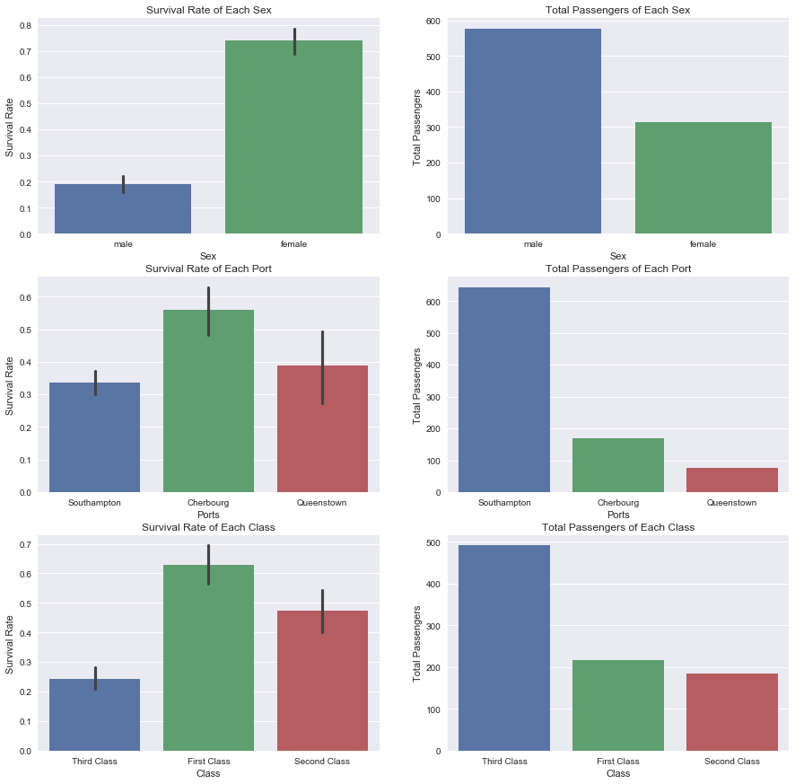
Comparing survival rate to the total in each category is necessary to get an accurate view of how the data is distributed. Several conclusions from the resulting plots can be made:
-
Females had a much higher survival rate than males although there is nearly double the amount of males. This is concurrent with the original assumption that women and children had higher rates of survival
-
The port in Cherbourg had a higher survival rate than other ports. This could be due to wealthier neighboring towns around that port. This would also make sense for the Southampton port. There are so many passengers which could be due to less wealthy neighboring towns and also relate to the lower rate of survival.
plt.figure(figsize=[10,10])

#Families
plot5 = plt.subplot(221)
sns.barplot(titanic_df.SibSp, titanic_df.Survived)
plot5.set_ylabel('Survival Rate')
plot5.set_title('Survival Rate for Siblings/Spouses')

plot6 = plt.subplot(222)
sns.countplot(x='SibSp', data=titanic_df)
plot6.set_ylabel('Total Passengers')
plot6.set_title('Total of Siblings/Spouses')

plot7 = plt.subplot(223)
sns.barplot(titanic_df.Parch, titanic_df.Survived)
plot7.set_ylabel('Survival Rate')
plot7.set_title('Survival Rate of Parents/Children')

plot8 = plt.subplot(224)
sns.countplot(x='Parch', data=titanic_df)
plot8.set_ylabel('Total Passengers')
plot8.set_title('Total of Parents/Children')
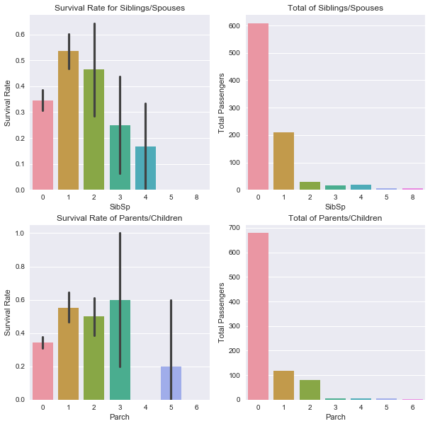
It is difficult to draw conclusions from the data with family members since the values are so spread. From the Survival Rates, it looks like having some family members related to higher rates of survival. Although from the totals, there appear to be 600-700 lone travelers which is innacurate. This data is overlapping and falsely making it seem like the 0 column means a lone traveler which it may not. The best way to combat this is combine this data into a Family category.
#Create new column grouping familys together
titanic_df['Family'] =  titanic_df["SibSp"] + titanic_df["Parch"]
titanic_df['Family'].loc[titanic_df['Family'] > 0] = 1
titanic_df['Family'].loc[titanic_df['Family'] == 0] = 0

plt.figure(figsize=[10,5])
plot9 = plt.subplot(121)
sns.barplot(x='Family', y='Survived', data=titanic_df)
plot9.set_ylabel('Survival Rate')
plot9.set_xticklabels(["Alone","With Family"])
plot9.set_title('Survival Rate With or Without Family')

plot10 = plt.subplot(122)
sns.countplot(x='Family', data=titanic_df)
plot10.set_ylabel('Total Passengers')
plot10.set_xticklabels(["Alone","With Family"])
plot10.set_title('Total Passengers With or Without Family')
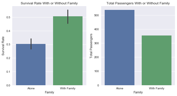
The assumption that there was overlapping data was correct. There were not 600-700 lone passengers. There are actually closer to 500. By combining the family data, there can be definite conclusions:
- Traveling with family members does mean there is a higher chance of survival. Since women and children are said to be most likely to survive, this would make sense since they would make up most of a family
lived = titanic_df[titanic_df['Survived']==1]
died = titanic_df[titanic_df['Survived']==0]

#Barplots to view variables vs Survival
plt.figure(figsize=[15,5])

#Histograms to view spread of data comparing survived(green) and died(red)
plot6 = plt.subplot(121)
sns.distplot(lived['Age'].dropna().values,bins = range(0,81,1), kde = False, color = 'lime', axlabel = 'Age')
sns.distplot(died['Age'].dropna().values,bins = range(0,81,1), kde = False, color = 'darkred')
plot6.set_ylabel('Number of Passengers')
plot6.set_title('Quantity of Survival/Death by Age')

#The Fare data is too difficult to view normally because of how spread out the values are.
#Scaling the data logarithmically to view based on order of magnitude created an easy to view graph
#log10 is undefined at 0 and below and negative between 0 and 1, so 1 needs to be added to all data points
plot7 = plt.subplot(122)
sns.distplot(np.log10(lived['Fare'].dropna().values +1), kde = False, color = 'lime', axlabel = 'Fare')
sns.distplot(np.log10(died['Fare'].dropna().values+1), kde = False, color = 'darkred',)
plot7.set_ylabel('Number of Passengers')
plot7.set_title('Quantity of Survival/Death by Scaled Fare')
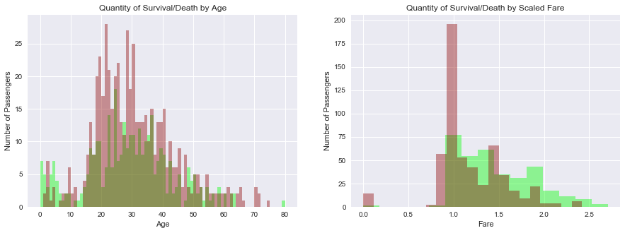
Viewing each factor against survival and deaths gives an idea of what the distribution of values looks like. These plots are shown based on survival only. Plotting these variables based on deaths created essentially the same graph but opposite bar heights and did not add more insight to the data set, so they were not inlcuded. For numerical values, deaths(red) and survival(green) can be better compared than with categories. Observing each variable, some conclusions can be made:
-
Higher fares would mean higher passenger class. Referencing the Class and Fare graphs show that the wealthy did have a better survival rate
-
There is a larger amount of red in the Age plot which makes sense due to a 38% survival rate. Children have a better survival rate below the age of about 18. Ages 20 to 30 had a spike in deaths and evened out after. Possibly having to do with middle age people affording more expensive tickets and given life boats first, referring to the fares plot
There is a clear spread of values between male and female survivors. Grouping this data with other categories could give a more clear view survival. Taking age into consideration with sex results in the plots:
livedm = titanic_df[(titanic_df['Survived']==1) & (titanic_df['Sex']== 'male')]
livedf = titanic_df[(titanic_df['Survived']==1) & (titanic_df['Sex']== 'female')]

diedm = titanic_df[(titanic_df['Survived']==0) & (titanic_df['Sex']== 'male')]
diedf = titanic_df[(titanic_df['Survived']==0) & (titanic_df['Sex']== 'female')]

#Histograms to view spread of data comparing survived(green) and died(red)
plt.figure(figsize=[15,5])
plot8 = plt.subplot(121)
sns.distplot(livedm['Age'].dropna().values,bins = range(0,81,1), kde = False, color = 'lime', axlabel = 'Male Age')
sns.distplot(diedm['Age'].dropna().values,bins = range(0,81,1), kde = False, color = 'darkred')
plot8.set_ylabel('Number of Passengers')
plot8.set_title('Quantity of Survival/Death for Males')

plot9 = plt.subplot(122)
sns.distplot(livedf['Age'].dropna().values,bins = range(0,81,1), kde = False, color = 'lime', axlabel = 'Female Age')
sns.distplot(diedf['Age'].dropna().values,bins = range(0,81,1), kde = False, color = 'darkred')
plot9.set_ylabel('Number of Passengers')
plot9.set_title('Quantity of Survival/Death for Females')
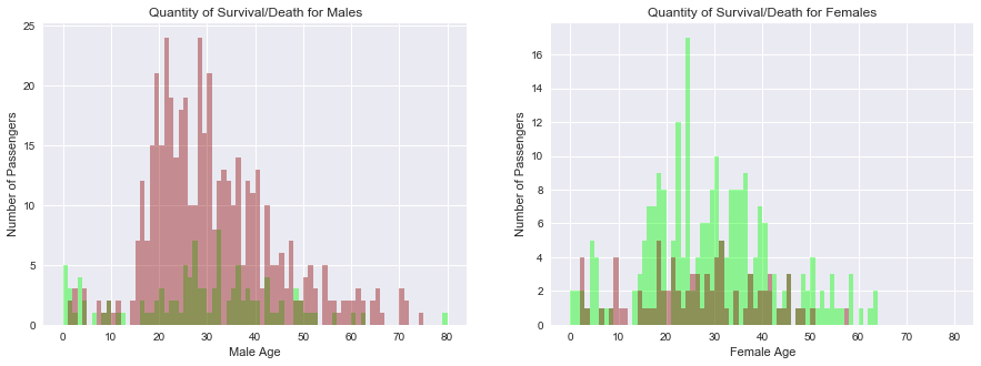
Some conclusions can be made regarding the information found in these plots:
- The original assumption that women and children are more likely to survive appear to be correct. Regardless of sex, kids under 10 still had a majority rate of survival.
- The rest of the ages appear to be the inverse of the other. There is a large amount of deaths for males above 15 while women have much better survival rates. Males above 30 have a slightly better chance of survival but are still overshadowed by death counts.
Correlating Values
Some assumptions were made after analysing each of the plots vs Survival rate. The variables may have some relation to each other instead of just Survival. Grouping certain factors together similar to the above plots should give a better idea of how Survival rate is affected. Correlating all the values shows which factors are the most useful to look at. A positive correlation means that as one variable increases, the other does as well. A negative correlation works inversely and one variable will decrease as the other increases
#First correlate all variables except for PassengerId because it is only an index
titanic_corr = titanic_df.drop('PassengerId', axis=1).corr()
#Put data in a heatmap to easily see correlations
plt.figure(figsize=[15,10])
plot=plt.subplot(111)
sns.heatmap(titanic_corr, vmax = .5, annot = True)
plot.set_title('Correlation of All Numeric Values')
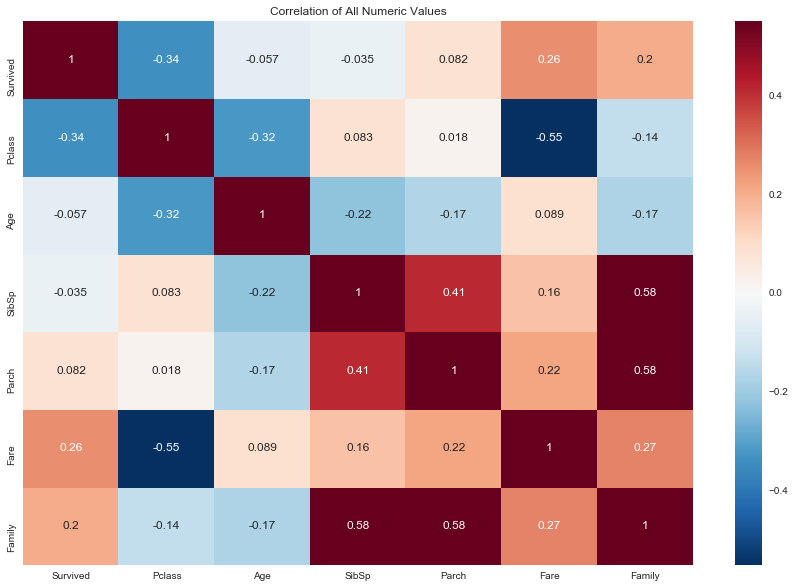
Darker colors show what variables may be useful to visualize. All factors in the survived column have already been shown above. Some other combinations also look promising:
-
Pclass and Fare: Strong negative correlation indicating that Fare increased as passenger class increased (higher class is a lower number )
-
Pclass and Age: Negative correlation indicating older people were in a higher class
-
SibSp and Parch: Strong correlation indicating a decent amount of families
Continuing using the Age category and the correlation to Pclass yeilds the plot below:
plot = sns.FacetGrid(titanic_df, col='Survived', row='Class')
plot.map(plt.hist, 'Age', bins=20).set_axis_labels('Age', 'Number of Passengers')
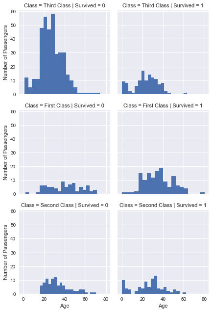
Splitting by passenger class shows there are considerably more passengers traveling in third class. Some new information can be gathered and some assumptions made before can be confirmed:
-
Older passengers tend to be in first class. Judging by the correlation of Pclass and Fare, this is most likely due to older passengers affording more expensive tickets. These first class ticketholders also didn’t appear to bring the whole family on the trip as there is a considerable less amount of first class children.
-
Children have the best survival rate out of anyone. Even in third class many of the children survived
-
Middle age passengers in first class actually had a better survival rate than the elderly
Conclusion
Limitations
The data that has been visualized is plenty to conclude our initial goal of discovering who was most likely to survive. However there are still many limiting factors in the analysis. Each numeric variable was correlated against each other. Just by looking at the values, this does not imply that one variable causes the other. For example:
There is some relation between age and passenger class. In the data set, older passengers tend to be in a higher class. However saying that the older someone is, the higher class they will be in, is false.
The conclusions that were made by looking at the data focus on correlations. Exploring other information related to each variable, more concrete conclusions could be made. Using general knowledge about the Titanic and the results from the data, each variable that was compared could be logically considered to relate to each other.
Since the data was a sample of everyone on the Titanic, the conclusions may not be accurate to the entire data set. For future research in order to determine this, a T-Test would need to be calculated since the population standard deviation is not known. If each value is calculated as significant, then the conclusions would be accurate
Cabin had too many missing values and any results from the data might not be accurate for the whole set, so it was omitted. The only real conclusions to be drawn would be if it was assumed the beginning letter was for each floor, then determine if higher floors had better survival. Logically, more expensive floors would be higher up and for high class people, so Cabin number was not needed even if there was no null values. Instead, Pclass and Fare logically covered any results that cabin number would lead to
Age was used even though there was a decent amount of missing values. This could cause some inaccuracies in the analysis since random values were used, but ultimately the trends in the graphs were good enough to draw conclusions from.
Summary
Based on the plots by age and by passenger class, it was clear that no matter what sex or class the children still had a high chance of survival. The Age plot split by sex also clearly showed that the majority of survivors were female. First class passengers also clearly had priority over other people. So it is safe to say that the women, children, and first class were most likely to survive
