Table of Contents
Overview
The New York City subway system is a notoriously busy part of everyone’s commute. Living in NYC has given me first hand experience of this. The biggest pressure point of commuting for me is getting stuck going in and out of the station. While it can only be for a couple minutes, those minutes drag on forever as I get sandwiched between people going both directions. This issue is the main focus of this post.
For my first project at Metis, my teams goal was to utilize MTA turnstile data to solve a problem of our choosing. We decided to pose as consultants working with the mobile app Citymapper and see if we could use traffic through turnstiles to direct commuters through less used entrances and exits while still being convenient to their trip.
Data Acquisition
The data that we utilised for this project can be found at the MTA’s website. The files for their turnstile data are located in multiple different links. To make it easier to grab all the data, I wrote a quick script that used Beautiful Soup to grab the link urls and download the first couple of 2018 to work with.
# get the page with all turnstile links
resp = requests.get('http://web.mta.info/developers/turnstile.html')
soup = BeautifulSoup(resp.text, 'lxml')

# read through html finding link tags
text_urls = []
for link in soup.findAll('a', href=re.compile(r'data/nyct/turnstile/turnstile_')):
    text_urls.append('http://web.mta.info/developers/'+link['href'])

# Only use from 2018
url_2018 = []
for u in text_urls:
    if re.findall(r'turnstile_18', u):
        url_2018.append(u)
i = 1
for url in url_2018[:5]:
    if i == 1:
        df_import = pd.read_csv(str(url))
        print("Downloaded " + url + " from MTA website")
    else:
        df_import = df_import.append(pd.read_csv(str(url)))
        print("Downloaded " + url + " from MTA website")
    i += 1
The MTA’s data isn’t the easiest to understand once you first look at it. The data the MTA collected reflects the condition of their subway system. If you aren’t from NYC, it is not great. Overall there are 11 different fields they collect data for. The focused features of this project can be seen below:

- C/A: The control area/booth name for the booth at a given station. Each station could have multiple C/A’s.
- Unit: The remote unit ID of a station.
- SCP: Subunit/Channel/Position. This is the specific address for any given turnstile.
- Station: The name that was assigned to a subway station by operations planning.
- Linename: A string that contains all the train lines stopping at that station.
- Division: The line that the station originally belonged to.
- Date: The date that the data was audited.
- Time: The time that data was recorded is in increments of four hours. These times can be staggered to prevent an overload of audit readings to the system.
- Desc: Description of the audit event. Can be “REGULAR” for normal times or “RECOVR AUD” if an audit was missed and recovered.
- Entries: A cumulative entry value for each turnstile. This is measured since the inception of the device. The memory of the turnstile is sometimes deleted or counts backwards from roll over or replacement.
- Exits: A cumulative exit value for each turnstile. Contains similar issues to the entries.
EDA
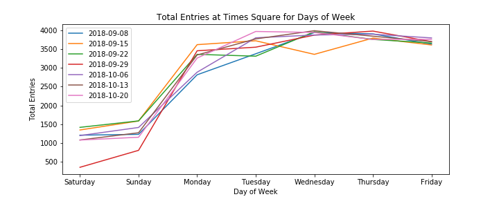
After filtering out and organizing the many glitches that occur in the entry and exit counts, I had the entry and exit counts for each day that I could plot to get an idea of trends in the data. The daily entries show clear trends of weekday and weekend trips.

Times Square is one of the top visited stations in NYC. The trends each week make sense showing the flow of traffic on weekdays and weekends. The most useful times that would see the largest benefit of optimizing subway traffic would be during the week.

Calculations/Findings
Looking at each control area would give us an idea of the traffic going through specific subway entrances. In order to determine which entrance would be best, we needed to create a metric that would allow us to rate how busy the control areas in each station were.
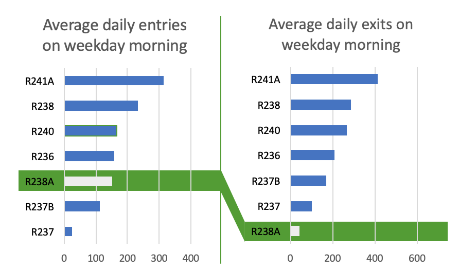
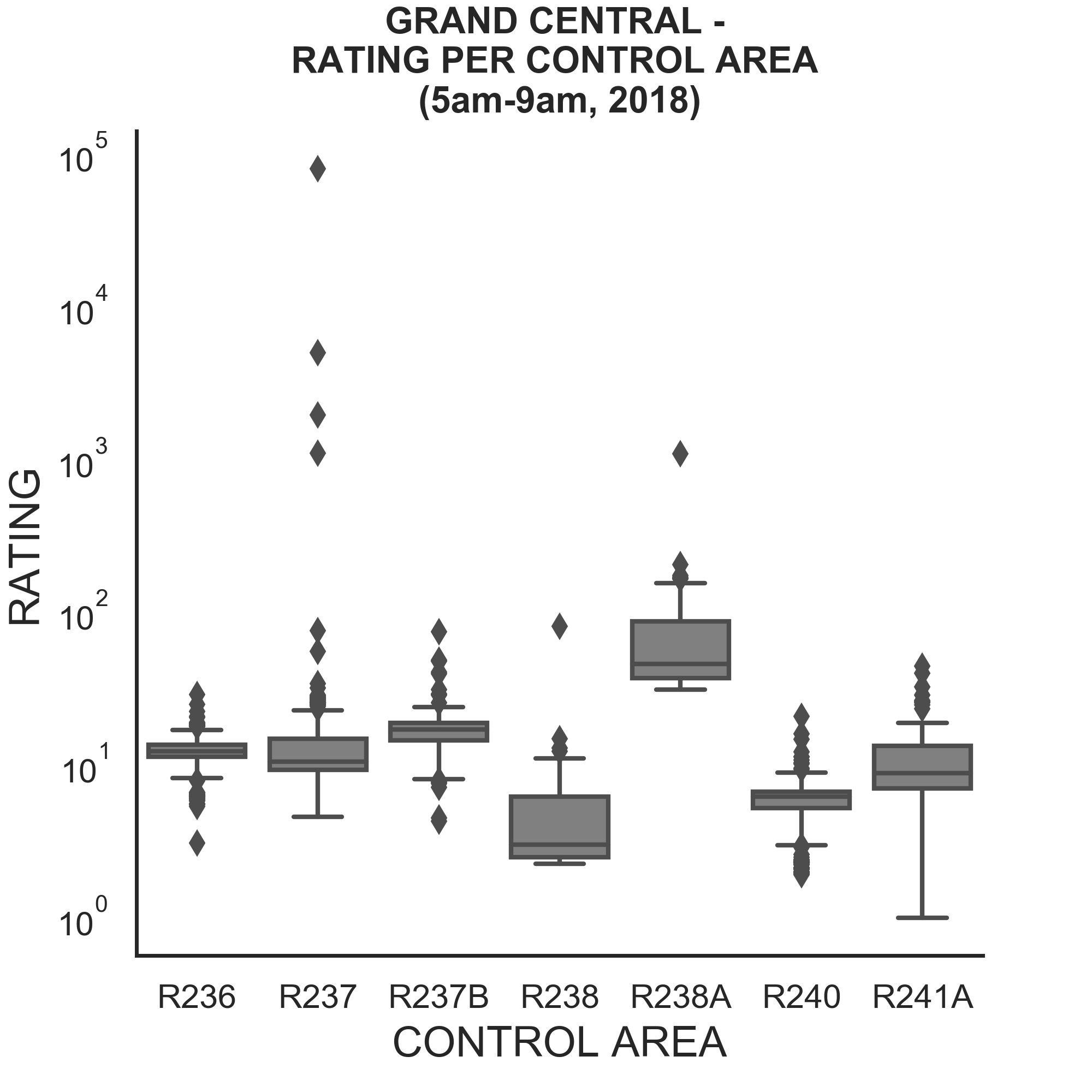
This formula we made will weigh stations with more entrances than exits as a lower rating. A better station to enter would be one that has less traffic coming out of it since it is easier to move with the flow of people than against them. This formula proved useful in uncovering the best stations to enter. The plots below show the distribution of entries to exits in Grand Central as well as how our formula rated each of the entrances.


The entrance R238A is consistently the best entrance during the morning times even though R237 has the least amount of entries at those times. So the formula is showing promising results. Looking further into more stations shows that there is clear winners in multiple situations.

Conclusions
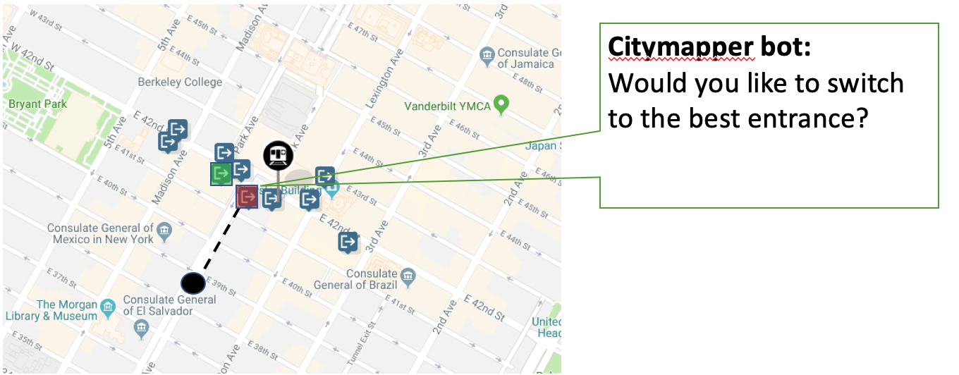
We successfully uncovered the best entrance that someone could use to avoid the hassle of fighting through a crowd. However, if our system reccomends an entrance completely out of the way, what use will it actually be? The important thing to keep in consideration is that this reccomendation system will only come into effect when traffic is particularly bad. It would just be an added level of comfort in the app knowing that you can avoid the crowd. An actual implementation of the feature might look like this:

If a user gets directed to the same entrance every day and there is constantly a crowd, they might get iritated that Citymapper keeps sending them into a crowd. Instead of just directing a user to a calculated best entrance, it can tell them there may be a crowd and ask if they want to switch to the best closest entrance.
Limitations
Using the MTA data proved as an effective way to uncover the fact that there are more efficient ways to operate the NYC subway system. However our analysis is limited to the quality of the data that the MTA collects. This could cause some issues with results as it is not the best kept data. The turnstile counters occasionally reset to 0, presumably for maintenance. They also sometimes start counting backwards and go negative as well as exceeding 5,000 passengers per day through a single turnstile. We were able to account for these issues as well as possible.
Our analysis is also grouping entrance and exit counts into periods of four hours due to when the counters are recorded. If Citymapper were to implement a feature like this, it would be more effective to see how many direction requests are going to certain stations and base their decisions on those numbers. Then real-time data could be used to direct users.
To notebook containing the project workflow can be found here
